
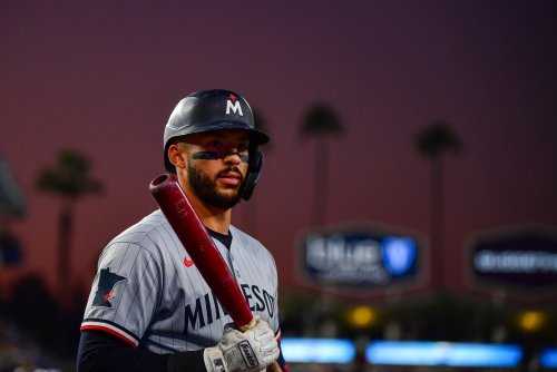
Regardless of their place in the American League standings, the Minnesota Twins have the best team name in all of baseball.
They might have the best team name in all of sports, quite frankly. They’re not named after a common creature or maritime menace, not for an article of clothing or a common bird. Diamondback rattlesnakes are found according to elevation, not state lines. The Brooklyn Trolley Dodgers took their name from a frequent occurrence at their previous Brooklyn grounds, from which they departed in 1957, and no longer applies. The uncertain etymology of the term yankee, or yank, begins at the Battle of Lexington, which occurred in Massachusetts.
So the next time you’re counting American League pennants, you can console yourself with the fact that some of the winningest teams in baseball are, to some degree, misnamed.
The Twins do not have that problem. Quite the opposite: uniquely, they are named for a pair of cities, and had owner Calvin Griffith had his way, they would have been called the Twin Cities Twins. That goes pretty hard, even for 1961, so he condescended to name them the Minnesota Twins, which also makes them the first team to recognize their state and not their city. Griffith never considered another nickname; he didn’t have to. It’s perfect, a clever way to please the Don Drapers of Major League Baseball and have his own way.
What the Twins cannot lay claim to is the best logo in baseball, nor the uniform to accompany it. We must take action to correct this imbalance.
THE LOGO
The best logo in all of baseball, and perhaps all of sports (honorable mention to the New Jersey Devils), currently adorns the caps of our neighbors in Wisconsin. The Milwaukee Brewers brought back their classic, all-time great ball-in-glove logo before the 2020 season with a pretty hype video featuring firemen, teachers, welders, and Chicago Cubs manager Craig Counsell:
I mean, they used the hashtag #glovestory, for crying out loud. It’s too good, the kind of brand ownership that can propel a small-market team to churn out pitchers and situational hitters like kegs of lager. The only thing better than the marketing is the product itself.
The problem for the Twins is that they don't really have an all-time great ball-in-glove logo from 1978. We have Minny and Paul, who are totally awesome, but a little much for New Era to stitch into every Twins hat and jersey sleeve. I’m a big fan of the classic “M” from 1987 to 2009, especially after last year’s Hall of Fame Weekend reissue.
This logo speaks to nostalgia, not aesthetics. It’s iconic, but not as clever as the name of the team it represents. It speaks to October's long past: for some, it recalls the elation of childhood; for others, the city’s mythology.
The Twins once made a similar play to the Brewers' in 2020. When Target Field opened in 2010, the Twins returned to a serif-heavy “TC” logo as a callback to the original. Looking at it now, side-by-side with the beefier 2023 “brand refresh” version: it looks rather sickly, and not really all that classic.
[caption id=attachment_207364" align="alignnone" width="843] Photo courtesy: SportsLogos.net[/caption]
I’d love the new white-and-red road “M” more if I didn’t instinctively confuse it with the 2012-18 Miami Marlins (a fish which is in no way localized to the Florida gulf, by the way). And the issue there, despite the red-star styling, is it’s still an “M.” Which makes sense, and I can get behind it as a fan, but in all fairness, it’s not even close to the top of the pile.
The problem -- and this is true for most teams in most sports -- is that neither the “TC” nor the “M” says baseball the way the Brewers' or Seattle Mariners' logos do.
THE UNIFORM
This year, the Twins will open their season with the same uniforms as last year, with one minor adjustment to the road rotation. Later today, when they take the field in the home opener, they’ll be kitted in their red-and-white
[caption id=attachment_207365" align="alignnone" width="843] Photo courtesy: SportsLogo.net[/caption]
Yes, it’s stylish, I suppose, what the kids are calling “a modern take on a classic.” We can’t seem to decide whether we’re a team that wears pinstripes at home, but this round seems to think not.
The jersey has also seemed rather austere. While I suspect this was conceived as elegant or minimalist, the script -- on all jerseys except the City Connect set -- features a single color: either white or blue. The road jerseys, particularly the new navy alternate, have some red highlights, but aside from the red-white-and-blue stripes appearing intermittently, everything is a solid color.
[caption id=attachment_207366" align="alignnone" width="1000] Photo credit: SpotsLogos.net[/caption]
I agree the Sunday navy-blue-and-off-white set remains the “best look in Minnesota’s closet,” but they still seem a cross between the best features of the Giants’ and Yankees’ unchanging identities. The callback to the Griffith story is clear, but we lose the underlined “win,” (the best feature of the script). The sense of austerity remains, and even on Sundays, the jerseys look rather empty.
THE FUTURE IS LATER
Clearly, we have passed the window by which this essay could be of assistance to the Twins’ branding and marketing departments for the 2026 season. But as we’re likely to have some time on our hands in 2027, now’s the time to poll the fanbase, get out the sketchpad, and find a way to match the quality of the uniform to the quality of the team name.
I recommend the following steps, in order of priority:
The time has come for a new logo. Honor Griffith’s decision to include both cities in his team’s name. You’ve got a terrific palette to play with: the traditional red, white, and blue; the letters “M”, “S”, “T”, and “P”; and a pair of home cities. Find a way to hide the river in there somewhere, the way the San Diego Padres hide the letter “P” in their interlocked “SD” logo. Above all: make it feel like baseball in the Twin Cities.
The San Francisco Giants revealed a new home cap that is absolutely incredible:
[caption id=attachment_207368" align="alignnone" width="400] Photo credit: Fanatics[/caption]
This design echoes a few other teams, like the Atlanta Braves and the Brewers, who feature an accent color on the front panel. The Twins absolutely need something like this. The Giants’ version stands out because the accent makes a subtle contrast rather than a bold one.
Decide whether the Twins are a pinstripes team at home. It’s been almost seventy years: let’s just pick. Can’t be iconic if you’re indecisive.
Go wild with the City Connect for 2028. This could be the subject of an entirely different essay, but I’m talking San Diego Padres-beach-party-wild. The Red Sox designed theirs based on a wall.
The Minnesota Twins could only play in the Twin Cities. The foundation is strong, even if the finances aren’t. They've fielded league-best teams, produced a one-of-a-kind first-ballot Hall of Famer (from both the club and the city), and won a bunch of division titles. Target Field is among the best ballparks in Major League Baseball, itself a master class in subtle branding that speaks to its home city. They have the best team name in sports.
But identity is crucial, and the Twins can show their commitment to winning by committing to it on the cap and jersey they wear every day. They can show their commitment to the cities they almost lost, and those who almost lost them. Subtle “tweaks” to the uniform profile won’t accomplish this. A new logo and the uniforms to celebrate would do more than fuel another marketing cycle.
It would make an unambiguous statement that the Twins are ready to lead the way in the new era of baseball that is nearly upon us, to provide a quality of competition to finally, consistently, match the quality of the name and the cities from which they derive it.
Think you could write a story like this? Hockey Wilderness wants you to develop your voice, find an audience, and we'll pay you to do it. Just fill out this form.
Recommended Comments
There are no comments to display.