

Day two is in the books, which means we have to rank the big schools' jerseys! Let's see how they fare.
8. Hill-Murray
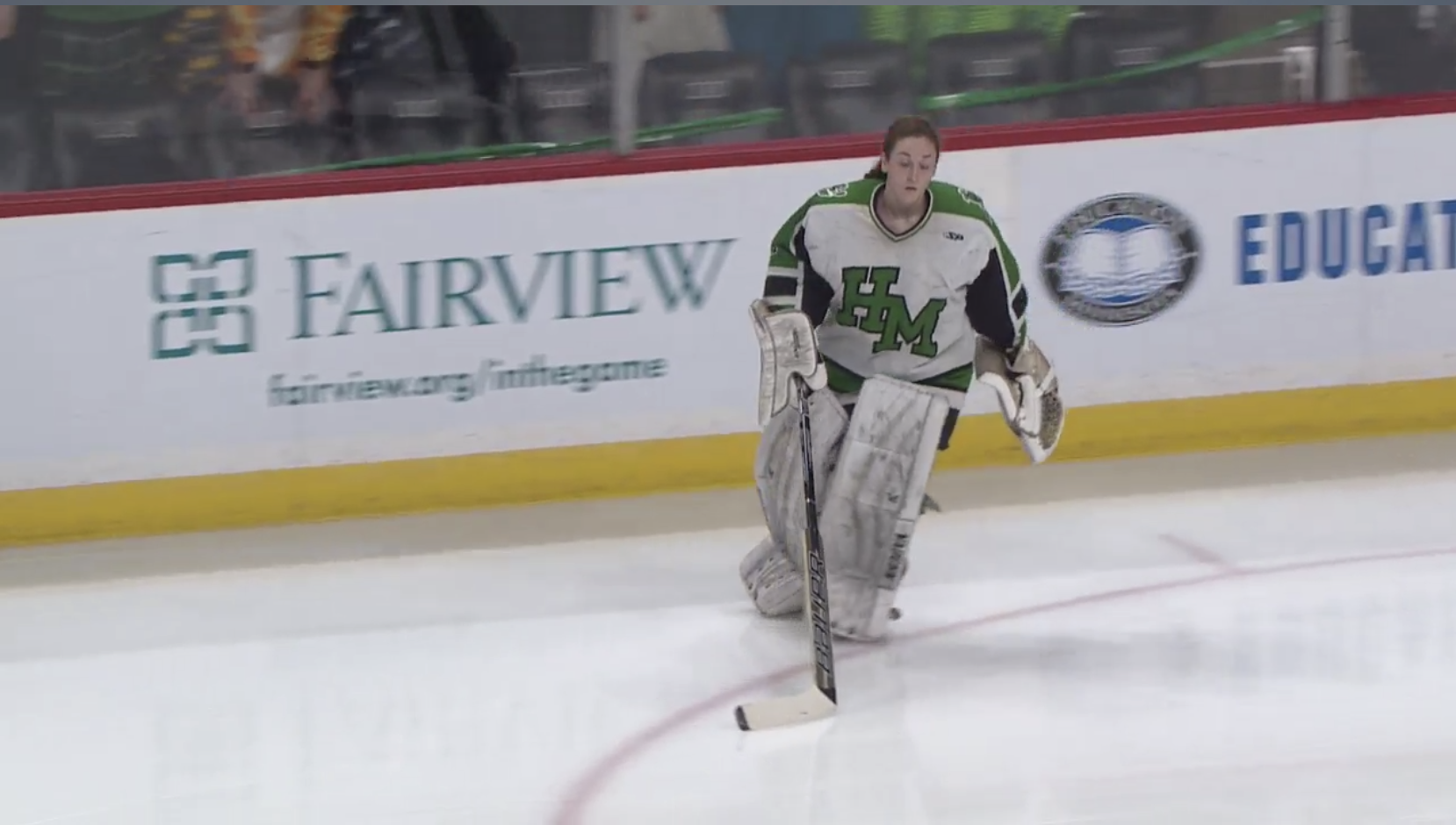
There is a lot to unpack here. Green stripes run from the shoulders all the way down the arm until they get cut off by black stripes. Why? Also, the black under the arms. Yeesh. Too much.
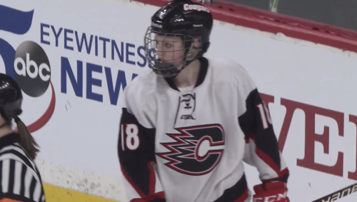
7. Centennial

To be fair, Centennial has a nice road uniform that was not seen on Thursday. But these are, well, something. The triangular black areas on the arms for numbers are unique, but not a great look.

6. Eagan
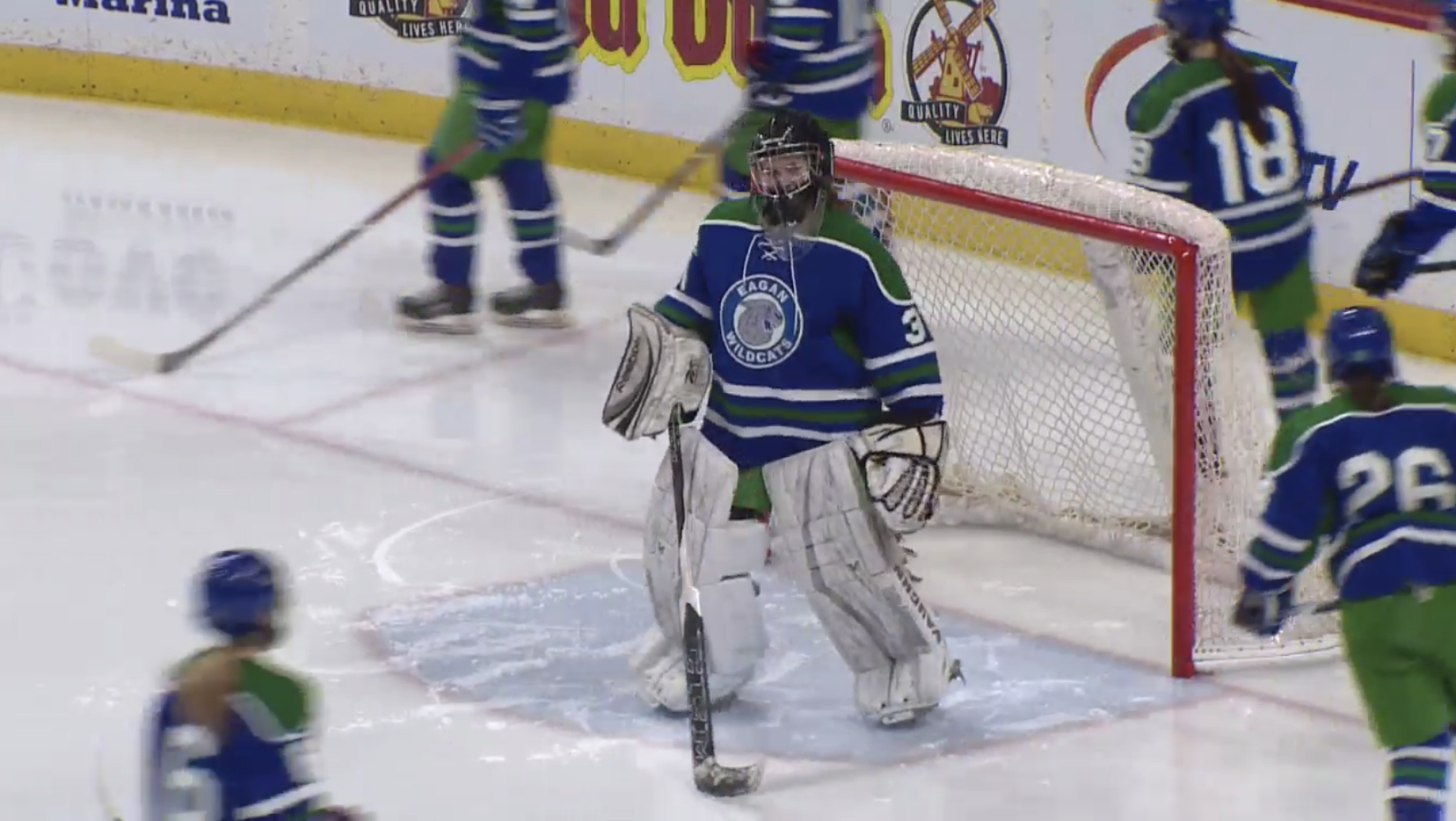
As mentioned yesterday, green and blue is not a great mix on hockey jerseys. Eagan brings more of that in the Class AA bracket, and even green breezers to match.
5. Lakeville South
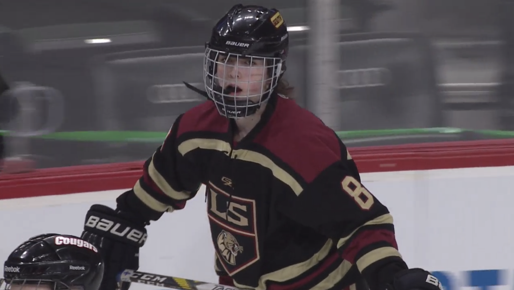
Lakeville South has a good color scheme, but way too many stripes on the uniform. In fact, if you drop the gold stripes below the shoulders -- or just add the gold as trim to the maroon shoulders -- that would be much better.
4. Brainerd

It's a simple look. It's Blue/grey, kind of reminiscent of the Hartford Whalers in a way. The cursive 'Brainerd' crest is good as well. Not bad.
3. Andover

It's a good modern look. Black shoulders. 'A' patch on the shoulders. Nice looking crest. Solid striping on the arms and bottom of the jersey. Maddie Rooney would be proud.
2. Eden Prairie

One can never go wrong when basing their jersey off the Chicago Blackhawks. The black diagonal 'Eagles' down the front is a nice look, to go along with a solid jersey design.
1. Edina

It's a good classic look. I've always been a fan of the Hornet over the 'Edina' crest. Good green and yellow mixture on the white jersey. No, this writer was not paid off to put them at No. 1.
Never Miss an Episode of Giles & The Goalie!

Think you could write a story like this? Hockey Wilderness wants you to develop your voice, find an audience, and we'll pay you to do it. Just fill out this form.
Recommended Comments
There are no comments to display.