

For the first time, the MSHSL Hockey Tournament Jersey rankings comes over to the girls' side. Let's check in with the Class A teams from the first day of the 2018 tournament.
8. Proctor/Hermantown

Sorry, but a green and blue mixture here is not a good look.
7. Marshall

The diagonal stripes up the bottom of the jersey are quite something, but then putting 'Marshall' on the white really brings down the jersey here. I love the laces and crest, but diagonal stripes need to go.
6. New Ulm

It's a simple look, but the white stripe up the side and then onto the shoulder just looks weird. There's a much better way to put white stripes on the jersey, and this is not it.
5. St. Paul United

It's not a bad look for being a combined team. But the 'U' gets to be too much as both the crest and on the shoulders. You don't see it, but the 'U' also shows up on the socks as well.
4. Alexandria

With a look like this, teams can go a bit overboard. But Alexandria actually makes this a good look with the mixture of red and black. Stripes, shoulder bars, and different shoulder patches give us a good modern looking jersey.
3. Red Wing

It's a simple look, nothing fancy. Solid use on the stripes and good crest on the front. Can't go wrong with Red Wing.
2. Breck
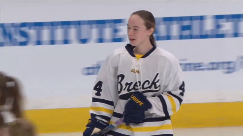
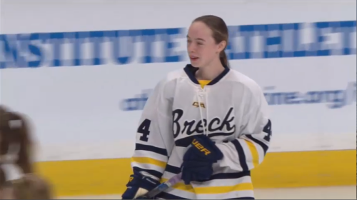
Multi-colored stripes often don't work, but Breck pulls it off well. Also, the cursive script crest is a very very good look. In other years, Breck takes home the top spot, but they fall second this year.
1. Warroad

Simple, stripes, etc. Simply put, its an iconic look in Minnesota Hockey history.
Never Miss an Episode of Giles & The Goalie!


Think you could write a story like this? Hockey Wilderness wants you to develop your voice, find an audience, and we'll pay you to do it. Just fill out this form.
Recommended Comments
There are no comments to display.